Web Design Process
Designing a web site is a process consisting of six phases:
- Project Definition
- Site Structure
- Visual Design
- Site Development
- Testing
- Launch Plus


We spend a lot of time asking ourselves, our clients and other people questions. Whether it’s choosing the perfect shade of green for our latest web layout or figuring out how to implement a complex typographical solution, the ability to ask the right questions is among the most critical of skills for a web designer. In this article, we’ll go over 60 specific questions that web professionals should ask before taking their website public.
Many professionals work with the aid of checklists, while others routinely check for certain issues as the design evolves. While there isn’t a sure-fire way to avoid the embarrassment of forgetting something post-launch, the habit of continually questioning your work as you develop a website is critical. Sometimes it can be as simple as "Does this work?"; in other cases, more technical questions need to be asked (and answered).
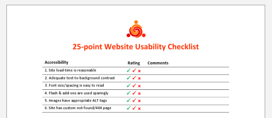 The 25-point Website Usability Checklist (PDF) can be a helpful aid to your workflow.
It doesn’t make the job any easier to second-guess yourself into a state of neurosis (something perfectionists do quite often) or to make blind decisions. There’s no perfect method for gauging a project’s needs or the decisions we make, but asking difficult questions during the process helps us avoid issues later on.
One of the central tasks of web design is project management. Building a new website is like setting the foundation for a house. With so many details to deal with, planning ahead and managing the ongoing tasks is essential.
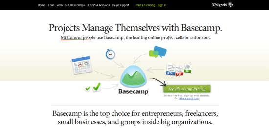 Basecamp is a popular and effective project management app.
1 Has the client signed the contract? Working without a contract is extremely risky.
2 Do you know what the final product should look like? Having a solid plan of action, including a few diagrams, wireframes, prototypes or mock-ups, can enhance clarity.
3 Has all of the content been written? A website without content is like a painting without a canvas; ideally, a website should be built around the content, not vice versa.
4 Does the website require any pre-built solutions? Life can be made easier with tools such as content management systems (e.g. WordPress) and scripts, so determine what you need before you start coding.
5 Do you know what the competition offers? Your rivals are often the best source of ideas, and knowing what they offer can help you meet visitors’ expectations.
6 Have you set appropriate deadlines? Setting realistic deadlines and tracking your progress towards those deadlines is always important.
7 Will you need to factor in additional costs? Websites are relatively inexpensive, and you can build a good one using free software, but still, you must be on top of any expenses you might incur.
8 Do you have the necessary skills? Some websites are more complex than others; consider which technologies you will need to work with and whether your knowledge of them is current.
9 Have you thought about marketing? A website without visitors is useless. Look into your options for social networking, SEO, advertising and more.
10 Will the website actually be useful (or even necessary)? There is no point wasting your energy on a project that will have no value for end users, so start by weeding out bad ideas.
11 Is a target audience mapped out? Knowing what kind of people you hope will visit the website will help you not only write appropriate content but design effectively, too.
12 Do you have a checklist or criteria? Even a set of basic criteria to maintain quality control or a checklist for larger projects would help.
13 Can your host cope with the demand? Getting the right type of hosting is important; there’s no point in having shared hosting if you’re going to be streaming gigabyte-heavy video.
14 Have you got the media? Some websites require video, audio and special file types such as PDF documents. Accounting for assets early on lessens the risk of launch delays.
15 What features do you hope to include? Perhaps you need to accept payment, or maybe you want a photo gallery. Whatever you need, plan ahead prior to designing the layout.
Next up are questions to ask regarding writing code. If you design or develop websites, you’ll find yourself working with HTML, CSS, and JavaScript. Every language has a range of best practices and guidelines to follow, which is great if you want to standardize your end-product. However, there are a lot of other things to consider besides being standards-compliant.
 The impact of source code on the effectiveness of your content is often overlooked yet very real.
16 Does the code validate? While validation isn’t a complete testament to code quality, it does help to make sure that your code follows recommended standards and can show you errors in your markup, CSS, and JavaScript.
17 Have you considered using CSS3 and HTML5? Though many users still don’t use browsers that have CSS3/HTML5 support, if implemented with progressive enhancement in mind, taking advantage of these future W3C recommended standards gives your products added value and improves the craftsmanship of your web designs.
18 How semantic is the code? Using the right tag for the job is essential, and search engines love semantic code. Use for paragraphs, for hyperlinksand for clickable UI components that perform an action/user task.
19 Are you taking advantage of optional files and site add-ons? Whether in the form of using the Sitemaps XML protocol or including a favicon, these optional files can enhance your website. See five files that can improve your website.
20 Do you need an RSS feed? If your website is content-heavy and is updated frequently (e.g. a blog or news site), having an RSS feed will be a necessary site feature for keeping your users up-to-date with fresh content. If you don’t use a CMSwith this feature built-in, check out SimplePie, a PHP class for building your own RSS feed.
21 Will the code degrade gracefully? Graceful degradation (also known as fault-tolerance) — the notion that a system (in this case, a website) will still function under sub-optimal situations — is essential for flexible and web accessible site builds. Learn how to pragmatically apply graceful degradation when using CSS3.
22 Have you considered SEO? While search engine optimization should not dictate your design decisions, it wouldn’t hurt to consider how your website could be more visible in search engine results. Read some SEO tips to remember when building your site and ways to improve the SEO of your web designs.
23 Do you provide a printer-friendly style sheet? Designing a print CSS file is worth the time investment as many users still do print out web pages.
24 Is any of your code deprecated or non-standard? Using "dead code" such as the tag that was deprecated in W3C HTML 4 specifications as well as non-standard code such as the tag is frowned upon and won’t allow your work to validate against W3C web standards recommendations. Double-check that you’re not using any by taking advantage of free validation tools such as the W3C Markup Validation Service.
25 Do you need to use conditional comments? IE6 isn’t going to go away completely, and if your project requires you to support IE and to use browser-specific code, use conditional comments to serve IE-specific stylesheets instead of using hacks. This does two things: It gives you the ability to get your code to validate under W3C standards, and when you decide to stop using browser-specific code, you only need to remove the conditional comments in your site template. LeveragingJavaScript techniques for fixing IE6 and projects such as HTML5 Boilerplate to solve deprecated-browser rendering issues could be another option, but you’ll be stuck in scenarios where the user uses an old browser with JavaScript disabled — a scenario that is not as uncommon as you might think.
26 Are structure (HTML), presentation (CSS), and behavior (JavaScript) separated? This is important not only because it’s best practice, but also leads to more manageable and maintainable code.
27 Is your site navigation laid out in a practical way? The navigation menu is the most important part of your website. Getting it right is an integral part of an effective site information architecture.
28 Have you checked for unnecessary HTML elements and redundant CSS style rules? Code bloats easily, so strip away any non-essential and repeated bits of code for more maintainable and leaner (and thus, higher performance) website builds. For HTML/CSS optimizing purposes, check out HTML Tidy and CSSTidy.
29 Is the code organized and maintainable? Put care and attention into your code. Lay it out so that it’s easy to read, update and manage.
30 Would a framework enhance the site? These days, open source Ajax/web development frameworks such as jQuery and MooTools can speed up code-authoring and ensure fewer headaches due to cross-browser issues. If you suspect these frameworks might help, why not investigate and learn about them?
The process of creating a layout is full of questions related to color, typography and even distinctiveness. While your project management style may be superb and your coding technique beyond measure, design comes with its own set of questions. Web design calls for endless decisions, and that’s what these following questions are supposed to help you resolve.
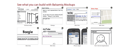 Using a wireframing tool like Balsamiq Mockups ensures a solid layout foundation.
31 Have you optimized your media? Images, videos and audio take up more bandwidth and space than anything else. Consider compressing and optimizing them with tools such as Smush.it.
32 Is the user interface overcrowded? If there’s one thing no one likes, it’s a stuffy and bloated design. Determine whether reductionism can help you design better websites.
33 Is the design distinctive and unique? With site templates in abundance, having a layout that’s fresh and eye-catching is a must. Breaking the mould may improve your brand’s identity.
34 When should I redesign? Are you able to produce something totally different or enhance what you have?
35 Does the layout make sense? Whether you pick one column or three, a lot of scrolling or none, decisions on your pages’ visual hierarchy will directly affect readability.
36 Do the colors give off the right feeling? Color is closely linked to emotion; a palette can be the difference between a fun-looking website and professional-looking one.
37 What typography is best? As with color, typography affects the feel of the website. Build your font stacks wisely and attentively and take time to craft a masterful typography design.
38 How visible are links? Links have no purpose if they cannot be seen. Make sure you take the time to design your hyperlinks well.
39 Are you using enough white space? Too many websites squeeze everything too close together. If you add some breathing room, the result could be improved readability.
40 Have you considered content on-demand? With the rise of Ajax and fast content switching techniques, packing more data onto the page is easy. Consider doing this with very long web pages.
41 Is the design aesthetically pleasing? While this process is subjective, it’s still a good idea to get feedback from your friends, co-workers and perhaps a stranger or two to determine whether your work is visually appealing or not.
42 Is the content readable? Nothing is more important than content; if it’s legible and coherent, then your site users will be happy.
43 Does the design scale at various resolutions? Displays are getting bigger (bigger desktop monitors) and smaller (mobile devices) at the same time; make sure your work renders in all web-enabled devices. For mobile devices, take advantage of free tools for testing designs in mobile devices.
44 Are important site features emphasized? Some things are more important than others; consider the various ways that relevant content can be highlighted so that visitors can easily find it.
45 Does the website feel complete? This is probably among the most important yet difficult questions to answer. Recognizing when it’s ready requires a lot of care and thought.
The user experience is perhaps the most important factor for determining the success of a website. Here are questions related to UX, usability, and accessibility.
 Accessibility, usability and compatibility: few things are more important. Silverback is a popular usability testing app.
46 Does the website work equally well across different browsers? There are plenty of browsers out there — make sure your website works well in the major ones. You can use a web service like Browsershots to preview your work in various operating systems and web browsers.
47 Is the website mobile-friendly? While desktop browsers are pretty straightforward (with the exception of IE), mobile devices require an extra bit of care and attention; read about best practices for the mobile web design.
48 Have you tested the website in a screen reader? Unfortunately, even with free screen readers out there like Fire Vox, a screen-reading add-on for Firefox, few web designers consider testing their designs for screen-reader web accessibility. You might want to.
49 What happens when JavaScript is turned off? Not every experience is the same and we can’t control the visitor’s browsing environment, so try to make sure your website gracefully degrades when JS is turned off.
50 Do you offer alternatives to Flash content? Following on the previous point, if your website is particularly Flash-dependent, you might want to make sure that youruse of Flash is accessible.
51 Did you remember alt attributes? One of the simplest accessibility aids to implement is using descriptive and useful alt attribute for images.
52 Have you evaluated your website against Web Content Accessibility Guidelines? Complying with web accessibility best practices is important for users who have disabilities that affect their capability to browse the web. Fulfilling the recommendations in the W3C Web Content Accessibility Guidelines (WCAG) is the perfect place to start.
53 Has the website been tested by other people? Usability testing is quite easy and expensive to carry out nowadays. Performing tests could give you ideas for improvements. Check out web services such as Concept Feedback and Feedback Army.
54 Do your URLs make sense? URLs that are easy to read will give potential visitors the chance to predict where they’re headed (and is good for CEO to boot). Using pretty URLs (example.com/about-us) instead of system URLs (example.com/?p=655) can enhance the experience of visitors. If you’re using a content management system or a custom-built app, learn about rewrite engines.
55 How quickly does your site load? Speed is an important factor of usability. Consider how your website will affect visitors, particularly ones on slow connections.
56 Is the search functionality easy to use? Most websites need a search box to help visitors locate the information they need. Ensure that yours is easy to use and that the results are accurate.
57 Will there be any potentially obnoxious behavior? Whether it’s pop-ups and modal windows that won’t close, or scripts that cripple right-clicking, make sure your site doesn’t have behavior that annoys users.
58 Are your web forms usable? If you’re asking for too much information or your forms are too hard to complete, people will enter fake details or simply refuse to submit the data.
59 Can the site owner be contacted without difficulty? While you might get spammed in the process, allowing visitors to send you an email or to initiate a Skype call could be a great way to connect with them.
60 Have you checked for broken links? Root out dead links in every nook and cranny. Tools such as Xenu’s Link Sleuth can automate the process; learn how to discover broken links in your website.
As we learn and grow, our competency increases, which changes our perspective and workflow. Designers and developers who regularly question their methods and ideas are usually the ones who get the job done right and are the ones who consistently improve their processes and products.
Getting a website up and running to promote your fitness or personal training business *should* be a straight-forward process.
But have you ever had that feeling when working with someone that you just don’t know whether they really “get” you, understand quite what it is you’re looking for or never seem to advise you on what will be best to promote your fitness business?
Whilst some web design firms may tell you not to worry, sit back and relax and they’ll cook you up something snazzy to help you attract more personal training clients, in our experience it doesn’t quite work like that…
Unfortunately, if you want a website that actually does something for your business (generates leads, answers prospects’ questions, helps keep leads warm) rather than just look snazzy, it will require you to provide some input into the process to ensure the website reflects what you can do for your clients – and just who it is you’re trying to reach in the first place.
Here are 4 important questions your web designer should ask you before they even start designing your business website…
#1 What’s the purpose of your website?
To design an *effective* website for your personal training business (one that does what you want it to do), this should be the first question a designer asks you. The purpose of your site (to attract interested people, the showcase your wares, to interact with prospects, to provide additional support etc.) will determine the functionality, lay out and even the look and feel of your site.
If your designer doesn’t ask you this, how can they build you a site that will do the job you want it to?
#2 Who is your target market?
Another crucial question which can determine the navigation, layout, contents and look and feel of the site; web designers who don’t ask this will usually design something they think looks great – and you may even think so too – but will your target market think the same or will it just turn them off?
#3 What messages are you looking to convey on your website?
Like the above question, the kind of messages and the way you want to convey them on your site is something your designer needs to know; if you’d like to convey a modern, high tech, ‘with the times’ approach then using video or audio to do this may be a great choice to share your message; if you’d rather convey a more traditional, old-fashioned message, then this may not be such a great choice.
It once again all comes back to your target market and the way they’ll respond most effectively to the messages you’re looking to convey.
#4 How often do you think you’ll need to be able update your website?
If you’d like your personal training website to be a living, breathing work in progress or you’re not quite clear on your message or whether you’ve honed the copy correctly – and you’re likely to want to make frequent updates to the site even once it’s built – then think about how expensive this might get when you have to pay your web guy to make the tiniest of changes for you.
They will (and should be) charging for this and therefore asking this question before they get started on anything may determine the web platform they build your site upon. There are many options which allow you to update your own website, just ask your web design company about the most suitable one for you.

We’re always on the lookout for new ways of doing things better and faster at Box UK. One area of change that we’re particularly excited about involves our User Experience (UX) design process. Taking inspiration from UX leaders like Brandon Schauer, Leah Buley and Todd Zaki Warfel, we’ve embraced the use of sketchboards to collaboratively generate, evaluate and refine User Interfaces. Based on the Design Studio method, this approach has enhanced the collaborative process between us and our clients, and dramatically reduced the time required to achieve the desired results.
Like all good User Experience designers, I have a bit of a stationery fetish, with more expensive notebooks and marker pens than could possibly be healthy. I’d always start any interface design on paper before firing up my favourite wireframing or prototyping tools, but my sketches were only ever intended for my eyes only – I’d try a few things out, and as soon as I was happy with my creation, I’d create wireframes of varying fidelity to share with colleagues and clients. Any feedback would be worked back into the wireframes and repeated until everyone was satisfied with the final output. Although fairly time-consuming, this method has been working perfectly well for us and our clients for a number of years.

Back in May of this year, I was fortunate enough to attend UX London, where among many great presentations and workshops, I saw Leah Buley of Adaptive Path present her excellent “Good Design Faster” workshop. The workshop described Adaptive Path’s own process of rapid ideation, communication and collaboration using low-fi sketching techniques and sketchboards. Their process is adapted from the “Design Studio” method, which is a commonplace teaching method in urban and architectural design. Essentially, the Design Studio method is a collaborative sketching workshop, where stakeholders work together to generate, evaluate and refine their designs.
“The goal is to generate a number of concepts, get them out of your head as quickly as possible, and move on.”
Todd Zaki Warfel
In his book “Prototyping – A Practitioner’s Guide” Todd Zaki Warfel describes sketching as “the generative part of prototyping”. He continues “The goal is to generate a number of concepts, get them out of your head as quickly as possible, and move on.” As firm believers in the power of prototyping, we’ve found that sketching significantly speeds up the prototyping process.
I first got the chance to put this technique to work on an internal project, so with the reduced risk, I commandeered a colleague, purloined an armful of office supplies from the stationery cupboard and we set to work, sketching and scribbling like men possessed. As we finished a sketch, we discussed and critiqued each other’s work and fine-tuned our sketches before sticking them to the wall. By the end of the day, we’d sketched out an entire application from scratch. Once the sketchboard was complete, we invited colleagues to review our work, letting them know that all feedback and criticism, however negative, was a required part of the process.
For us, the mere fact that we found the sketchboarding technique an enjoyable and productive activity was reason enough for us to include this as an integral part of our design process. It wasn’t long before we were able to try out sketching on a real client. We were delighted to find that the results were even better than our first attempt, and the feedback from our client was way beyond our own lofty expectations.
We use Jesse James Garrett’s ‘Elements of User Experience’ approach to User Centred Design, so sketchboards fit naturally at the beginning of the Skeleton Plane. As we’ve already covered Strategy (business objectives, users, personas, user needs and success metrics); Scope (functional, content and technical requirements); and Structure (information architecture and interaction design), we already know why we’re building the site, who we’re building it for, what the requirements are and how those requirements are to be structured. We use any relevant information from the preceding stages as inputs – we continually refer to these as we sketch.
First of all, you need a big, blank canvas on which to stick your inputs and sketches. We bought a huge roll of brown craft paper. Take a length (about 8 to 10 feet usually works for us) and stick it to the wall with lots of BluTack – the sketchboard gets progressively heavier and may fall off the wall if you’re too parsimonious with your sticky stuff.
Gather any information that you’ll need to guide you through your sketching, whether it’s sitemaps, flowcharts, scope items, user needs or personas or any inspiration that you think will help, and stick these to the left hand side of your sketchboard. I like to include a list of the interfaces that are required in the session so I know my target at the outset.


Start with a 6-up template and give yourself a fixed amount of time (say 10 to 15 minutes) to draw as many different versions of the interface you’re going to work on. Try out any idea that springs to mind. Don’t like the vertical navigation? Try horizontal tabs. Too many photos on the home page? Try a carousel.
Use the lined area on the right of the page for text annotations, notes-to-self and anything else that helps to communicate your idea.
Fine detail isn’t important here (as you’ll see from the following photo) – the point is to get your ideas down on paper. Don’t know where to start? – just do something, then change it.
Once you’ve done your thumbnail sketches take a step back and think about which one works best. Maybe you like some parts of one, and parts of another. Do another thumbnail sketch if this is the case, then refine it in the next step.


Now take a 1-up template and start refining your preferred thumbnail sketch. Again, give yourself a fixed amount of time to complete the task, say 10 minutes.
The extra space in the 1-up template allows you more freedom to think about details such as visual weight, headings, content and functional elements. Again, you’re trying to communicate how an interface may work, so the details are more important than the fidelity or tidiness of your sketch.


Once you’ve completed your refinement sketch, stick it to your sketchboard, then think about what problem you’re going to tackle next. Return to step 3 and repeat until you’ve sketched everything you needed to when you set out.
Try to keep your sketches in logical groups – use a Post-It note to give your group a heading. Once you’re happy with the position and grouping of your sketches, replace the Post-It headings with inked ones – a big chisel tip Sharpie works well (just make sure the ink doesn’t bleed through the brown paper and onto the wall!)
Now that you’ve fleshed out your ideas, it’s time to test your assumptions and gather real-time feedback. Ideally, you’ll do this more than once. We tend to have a review session with colleagues first, then we roll up the sketchboard, pop it in a tube and make our way to our client’s offices where we’ll take over the nearest wall (don’t forget the Blu-Tack).
Explain that you’re not trying to sell an idea and that feelings won’t be hurt if the sketches are criticised – indeed, this is the object of the exercise. If you’re feeling particularly brave, start a ‘black-hat’ session where everyone tries their hardest to point out the shortcomings of your sketches. These quick insights will challenge your assumptions, encouraging creative speculation and innovative thinking.
Your clients will appreciate being involved at this stage, and it makes for an enjoyable and productive session – so much better than emailing wireframes back and forth.
During the evaluation sessions, annotate your sketches, use Post-It notes, and amend or create new sketches as required to capture feedback, suggestions and corrections.
Now that your sketchboard is complete, fire up your wireframing or prototyping application of choice and get to work – you’ll find it so much quicker working from your sketches. Your clients will have already developed an understanding of your approach and direction, so you’ll spend less time amending and annotating, or explaining your rationale.